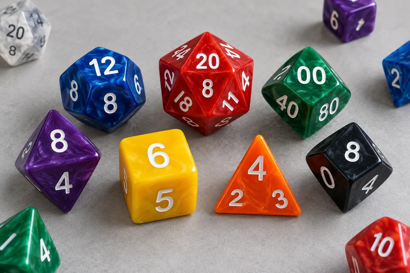
Accessible D&D dice have become a visible design topic following a recent official release: on October 2, 2026, D&D Beyond announced a seven-piece Disability Pride Dice Set created with Sirius Dice. The product description highlights larger numerals, distinctive colors, OpenDyslexic type, a different d4 shape, and an easy-open package. The announcement also says the design team recognized that one set cannot address every barrier experienced by every disabled player. That is the right starting point for anyone planning accessible RPG dice: design for specific tasks and users, not for a vague promise of universal access.
This guide turns that news into practical advice for players, game stores, publishers, dice brands, and Kickstarter creators. It explains what to check in an easy-to-read dice set, when color contrast helps, why tactile cues need thoughtful testing, and how to review custom dice samples before placing a bulk order. If you are new to dice shapes, our guide to the different types of D&D dice explains the standard polyhedral set.
What makes D&D dice accessible? The quick answer
That answer matters for both design and sourcing. A high-contrast set may help one player read a result but do little for someone who needs tactile information. Braille may be valuable to a Braille reader but unfamiliar to another blind player. A larger die may make the print easier to see while becoming less comfortable to hold or carry. Accessibility is a set of trade-offs that should be evaluated with users, not inferred from product photos.
Why accessible dice design deserves attention
Polyhedral dice put important game information on small, angled faces. Players have to pick up a die, roll it, find the upper face, orient the number, and communicate the result. A design can look striking in a product photo and still be hard to read under warm store lighting, at the far side of a gaming table, or after the die settles with a number close to an edge.
In the D&D Beyond announcement, the team describes its product as informed by research from Hasbro and Wizards of the Coast's Disability & Accessibility Alliance. The listed design choices address several different tasks: seeing and distinguishing numerals, interpreting the d4, identifying and storing the set, and using a digital version when that better fits the player. The article also notes the limits of a single product. Treat it as a useful example of design intent, not proof that every player will find the set suitable.
Accessibility guidance for tabletop games makes the same broader point. The American Library Association's Games and Gaming Round Table article by accessibility researcher Dr. Michael Heron identifies contrast, font size and complexity, tactile distinction, reliance on color, and non-standard dice as separate considerations. A research study with blind and low-vision tabletop players likewise recommends multimodal information and involving those players throughout design and testing. These sources are more useful than a simple “accessible / not accessible” label because they show how different features can solve different barriers.
Common barriers in standard polyhedral dice
1. Small, ornate, or ambiguous numerals
Decorative numbers can support a fantasy theme, but narrow strokes, flourishes, and crowded symbols can make a result harder to distinguish. Some faces may also be easy to confuse when rotated or viewed at an angle. Review pairs that can be mistaken for one another, such as 6 and 9, and check whether orientation marks are visible without becoming visual clutter. A readable typeface should be assessed at the actual molded or printed size, not only on a large artwork proof.
2. Color used as the only identifier
Distinctive colors can help players find a die or remember which die belongs to a pool. But color should not carry the only meaning. Players with color-vision differences, low vision, or poor lighting may not reliably separate two similar hues. Add another cue where the game requires identification: a clear label, simple icon, texture, or consistent placement. An American Library Association tabletop-accessibility guide specifically flags color-only information as a potential barrier.
3. Low contrast, glare, and changing light
Number fill that blends into the die body can disappear at a distance. Glossy surfaces can also reflect overhead lights, covering part of a numeral. Strong contrast between the face and number is a practical starting point, but do not assume one color pairing works for every player or environment. Test the sample under daylight, warm indoor light, and the store or game-room lighting where it will be used. Check the result from a seated position across a normal table, not only close to the camera.
4. Touch and handling are often overlooked
Most mass-market polyhedral dice communicate results visually. Adding Braille, raised marks, or distinct edge cues may create a tactile path, but these features need their own design and validation. The marks must be identifiable by intended users, located consistently, and usable without making the die awkward to hold or obscuring other faces. Do not assume that all blind players read Braille or that raised numerals will be easy to distinguish by touch.
The DOTS RPG Project is one real example of a group developing tactile polyhedral dice. It describes using a simplified numbering system, a consistent Braille cell, and a touch-point edge cue, with prototype testing and factory development over several years. That is a specialist product approach, not a quick decoration change. If a design brief includes tactile information, engage people with relevant lived experience and a qualified production partner before making a promise about usability.
5. Packaging, storage, and instructions
A player may be able to read a die but still struggle with a tight clamshell, small labels, tiny instructions, or a package that is hard to reopen at the table. Packaging is part of the product experience. Consider whether the opening can be found and operated, whether the dice are easy to return to their storage positions, and whether essential information is available in a legible format. For a custom launch, review our custom dice packaging options as part of the prototype discussion rather than after the dice design is locked.
Accessible RPG dice design checklist
Use this table to turn a general goal like “make the set easier to use” into decisions that can be reviewed on a physical sample. It is a planning tool, not a certification checklist.
| Design area | Questions to ask | What to test |
|---|---|---|
| Numerals | Are the digits simple, large enough for the intended size, and visually distinct? | Read every face at table distance and from more than one angle; check easily confused numbers. |
| Contrast | Can the number be separated from the die body without relying on a specific light? | View the sample under different light sources and against common table surfaces. |
| Color coding | Does color add meaning, or is it the only way to identify a die or result? | Ask users to identify dice using non-color cues as well; avoid close shades in a set. |
| Tactile cues | Are raised marks, Braille, or orientation cues part of the user requirement? | Include intended users in touch testing; check consistency, comfort, and whether cues are easy to locate. |
| Shape and handling | Can the intended player grip, roll, retrieve, and orient the die? | Compare sizes and shapes in a real play session; larger is not automatically easier for every hand. |
| Package and instructions | Can the package be opened, identified, and used without tiny print or unnecessary force? | Test the opening and storage process; review labels and instructions in their final printed size. |
| Alternative access | Can a player choose a digital or assisted method when that suits them better? | Make sure any digital route is usable and does not remove the player's choice to use physical dice. |
Not every custom dice project needs every feature. A retail set designed for low-vision customers has different requirements from Braille dice intended for tactile reading, and both differ from a branded Kickstarter reward with improved numeral contrast. Write down the target use, user group, and limitations before choosing artwork or tooling. For a broader overview of custom specifications, see our custom DND dice materials, logo, packaging, and MOQ guide.
How to prototype and test accessible dice
A useful accessible dice prototype process starts before artwork is finalized. It costs less to change a numeral, color fill, package opening, or orientation cue on a sample than after a bulk run. Use these steps with a supplier or product team:
- Define the task, not just the label. Write what the player should be able to do: identify a particular die, read the top face, distinguish two results, open the package, or roll with reduced grip strength. Avoid the broad and unsupported promise “for everyone.”
- Consult people who experience the barrier. Include disabled players early and compensate their time when possible. Ask what currently works, what fails, and what choices they want. A 2022 tabletop accessibility study recommends involving blind and low-vision people through analysis, design, prototyping, and testing rather than asking for feedback only at the end.
- Make more than one low-cost concept. Compare numeral styles, number-fill colors, die-body colors, sizes, and packaging approaches. If tactile or Braille features are required, consult specialists before selecting geometry; do not improvise a tactile marking from a visual mockup.
- Test the real sample in context. Use the intended table, lighting, storage, and game flow. Ask testers to identify and roll dice without prompting. Observe where they pause, request assistance, or choose a different method. Record preferences individually rather than treating one person's feedback as universal.
- Check manufacturing and use together. Confirm that the feature survives the planned production method, remains legible after finishing, does not make faces or edges uncomfortable, and can be repeated consistently. If a change affects the mold, material, number fill, or packaging, ask how it changes MOQ, cost, sample time, and production lead time.
- Document what the product does and does not do. Use specific descriptions such as “large high-contrast numerals” only when the delivered product actually has that feature. Explain known limitations and avoid claiming the set is universally accessible or suitable for a medical condition.
For a production conversation, a buyer can prepare a short brief with the target player group, game system, die types, numeral size and style, desired contrast, any non-visual cues, package requirements, target quantity, delivery country, and the testing plan. A custom dice sample kit can help compare materials and finishes, but a standard sample kit cannot validate a new tactile or custom accessibility feature on its own. Ask whether the sample matches the proposed final specification.
Buyer checklist for accessible custom RPG dice
Game stores and product teams can use these questions before approving a sample or placing a wholesale order:
- Which access need or play task is the product intended to support?
- Have players with relevant lived experience helped define and test the feature?
- Are numerals readable at the actual die size, including on angled faces?
- Can customers distinguish results without relying only on color?
- If tactile cues are included, who validated them, and are they consistent across all relevant dice?
- Does the set remain comfortable to hold, roll, retrieve, and store?
- Can users open and close the package and access essential product information?
- Do photos, packaging, and product-page copy accurately describe what has been tested?
- Are MOQ, sample approval, production consistency, packaging, and delivery assumptions clear?
For broader manufacturing questions, see our custom dice manufacturer page and quality and manufacturing overview. These pages describe the site's sourcing and production workflow; any accessibility-specific features should still be confirmed individually with the factory and tested on the approved sample before production.
Accessible D&D dice FAQ
What makes a set of D&D dice accessible?
No one feature makes dice accessible to everyone. Depending on the player, options may include clear high-contrast numerals, non-color identification, tactile cues, an appropriate size and shape, easier-open packaging, or a digital alternative. Ask intended users and test samples with them.
Are high-contrast dice enough for low-vision or color-blind players?
High contrast can help make numbers easier to distinguish, but it does not address every visual, tactile, cognitive, or motor barrier. Do not use color as the only identifier, and test the design in real lighting with intended users.
Do Braille dice work for every blind or low-vision player?
No. Braille is useful to people who read it, but it is not a universal solution. Tactile symbols, orientation cues, large print, digital tools, or a combination may suit different players.
Should accessible D&D dice be larger?
A larger die may make its numerals easier to see for some people, but it can also affect grip, rolling, portability, cost, and packaging. Compare physical samples with the people who will use them.
How do I evaluate a custom accessible RPG dice sample?
Check numeral clarity, contrast under actual lighting, identification without color alone, tactile features if included, handling, roll behavior, package access, durability, and production consistency. Involve disabled players and describe the tested features accurately.
Sources and further reading
- D&D Beyond: How the New Sirius D&D Disability Pride Dice Make Gaming Accessible for All Players (October 2, 2026). Official product announcement and description of its design goals and features.
- American Library Association, Games and Gaming Round Table: Accessibility and Boardgames (guest post by Dr. Michael Heron). Discusses contrast, font complexity and size, tactility, color dependence, and non-standard dice.
- Bolesnikov et al., “Understanding Tabletop Games Accessibility: Exploring Board and Card Gaming Experiences of People who are Blind and Low Vision”, TEI 2022. Research on player experiences, multisensory interaction, and involving blind and low-vision people in design and testing.
- DOTS RPG Project: Braille RPG Dice. A real specialist project describing tactile polyhedral dice, orientation cues, and user-informed prototyping.
The product details above are attributed to their original publishers. The checklists and buyer recommendations are editorial guidance, not a certification or a claim that a particular product is accessible to every person.
Planning a custom RPG dice concept?
Share the intended use, target users, dice format, artwork, possible readability or tactile requirements, packaging, quantity, destination, and sample plan. We can discuss the specification and confirm which options need factory feasibility review before a quote or production commitment.
Final takeaway
The most useful accessible dice design is not the one with the longest feature list. It is the one that supports a clearly defined task, gives players meaningful choices, and has been tested by the people expected to use it. Start with legible numbers and dependable contrast, add non-color or tactile information when users ask for it, consider packaging and handling, and be honest about limitations. For game stores and product creators, user testing is not a finishing touch; it is part of deciding what the product should be.